Viktor Baikovsky (Next), damn, that's how it is. I started to remove it... but then left it for some reason. Probably because the legs in black breeches almost blend into the background. Thanks!
Medvedev, a great series of portraits, in my opinion. GOOD! Viktor Baikovsky (Next), and not at all "tsk-tsk." IMHO, such seemingly "extra" details give the picture a natural look. Moreover, they don't distract or draw undue attention, i.e., they don't interfere with the frame. But that's a matter of taste, of course, and I don't think there's any point in arguing here.
they are not distracting and do not attract unnecessary attention
They are distracting, they are distracting...;) Of course they are... and the closer to the edge of the frame, the more so ;) but as was rightly said, it's a matter of taste
such "extra" details at first glance give the picture a natural look, or something
this can be used to justify all the photos where the lighting, composition, color, etc. are incorrect... all this will "give the picture a natural look"
GooDMooD, maybe so. Of course, only if it's the background. I'd like to preserve the softness of the light on the model. I'll try to tinker with the background tomorrow at work. My bad!
Medvedev, as you can see, I only touched the background. The easiest way was to select the Burn Tool in Shadows mode and paint over the background for 1 minute.
GooDMooD, nope, the original background is better, it's airy and blends seamlessly with Malvinka. Medvedev, don't mess with the background, don't blacken it, you'll ruin the photo and end up with a clip art image.
Igor Kozlov (adam_k), GooDMooD, darkened it just a bit, leaving some air (I specifically added some background while shooting to keep that air), but decided not to go completely black. Thanks for the opinions!
This blouse is somehow distracting in its ordinariness. Remove the black label, pockets, and zipper—they don't need to be emphasized here. The background on top looks off-white—it could be darker. Or maybe even color it. And the legs underneath aren't necessarily needed. You can remove them and compare. Otherwise—great photo, amazing hairstyle!

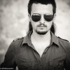

I liked it
Thanks!
Viktor Baikovsky (Next), and not at all "tsk-tsk." IMHO, such seemingly "extra" details give the picture a natural look. Moreover, they don't distract or draw undue attention, i.e., they don't interfere with the frame. But that's a matter of taste, of course, and I don't think there's any point in arguing here.
[2D], this can be used to justify all the photos where the lighting, composition, color, etc. are incorrect... all this will "give the picture a natural look"
as always, sharp and fair)))
But I'd like to darken the background a bit like this: http://goodmood.by/misc/malvina.jpg
My bad!
select the Burn Tool in Shadows mode and paint over the background for 1 minute.
It's a shame there are no recommendations left
Margarita Sklyarova, well, come back later.
Medvedev, don't mess with the background, don't blacken it, you'll ruin the photo and end up with a clip art image.
For me, it looks a bit whitish.
Thanks for the opinions!